This semester I have had to present quite a few presentations. I would call them PowerPoint presentations but I didn't do them with PowerPoint (I used Google slides), but I don't know what else to call them (like a Kleenex).
I find it interesting that my process in making a presentation is a little different then how I would write a paper, although some of my teachers talk about it like it is the same thing.
The main differences are that for presentations I try to think of how to portray my ideas in images or in as few words as possible. Images are tricky though because you can get images of almost anything on the internet but that doesn't mean it is legal to use it.
Sometimes I think I get distracted by trying to make things pretty or I should say, visibly appealing. Especially because I think some of my teachers could care less about the slides and grade it all on your presentation skills. Which brings up another point. Through several experiences this semester I have realized that I do much better at speaking in front of people when I don't have to memorize the words, and I can just talk. Finally, I often feel awkward doing PowerPoint presentations because I hate reading my slides for the audience. They can read it themselves! but yet I have to say something. I find it hard to balance between talking about the slides and letting my audience read them. Perhaps that is why I prefer the slides that have pictures because then I can just explain the pictures.
 |
| This was my opening slide. I made the explosions. |
 |
| This slide went with the previous presentation. I made the little sparks. I used them throughout the presentation. |
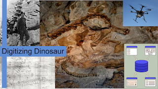 |
| This was the one slide I could use for my 3 Minute Thesis. I tweaked it for the final version and included references, but I did make the diagram in the bottom right. |
 |
| I just put some transparency on the background for this one. But I think it makes it less boring. |
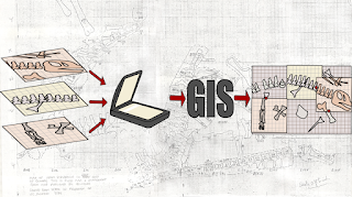 |
| This one I made with inkscape (vectors are cool!) to illustrate the process. |
 |
| This is from a presentation on coal. I made the diagram, but I liked the comparison between the two columns as well. |
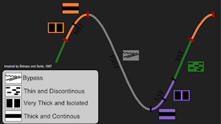 |
| This was also from my coal presentation. I basically remade a chart from an article I made using some of the terms that we used in my class instead of using the terms that were used in the article. |
Just so you know, these are the funner slides from my presentations. Most of them are just boring lists. I have to admit, when I watch other people present I judge their blurry pictures, and the ones where they don't reference where they got the image.


I can't decide if this is cool or just really geeky :)
ReplyDelete